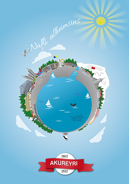
The 150 year anniversary of Akureyri
At work we often get really interesting projects, or at least projects we like solving in an interesting way. After we had been operating for about a year we were asked to create the identity for our town’s 150 year anniversary. It was a 10 day celebration with various cultural events, from events made by kids at the kindergarten to art exhibitions and outdoor rock concerts. To find something which everyone can relate to was a really exciting idea at first and then incredibly difficult at second and third thought. We dug into the identity and image of our town; its located at the bottom of the fjord, with mountains on both sides and extends into a agriculture rich valley. There are also two islands who belong to our town, one of which the arctic circle goes through. A river runs through the town and each side has their own football club and a landmark church.
We consider our town to be a friendly, nordic/scandinavian (strong danish influence both in architecture and culture) small town. Its the second most populated area after the Reykjavik/capital area and it takes at least 4 hrs to drive there. So its rather remote culturally and shopping here can be a drag. So remote that people in Reykjavik say we have our own accent! But we think that in general people are very proud of their town and never hide where they’re from when asked. So for the inhabitants, this little town is the “Navel of the Universe”!
So from there the idea came, for celebrating the 150 years we made a poster which shows most major landmarks of the town as if its just one globe. We have the old town, the theatre, churches, culture house, shopping centre, ski area and the puffin on the rock represents the islands that belong to the municipality.
The poster that I illustrated for our town’s 150 year anniversary. The plane is writing ‘Navel of the Universe’ in the sky
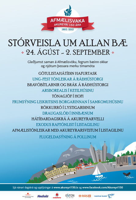
The advertisements were run in all print mediums as well as on TV, they had to include more text than could fit within the poster so we adjusted the illustration for the advertisements.
We received really great comments on the whole project, people saying it really captured the spirit of the town in an appealing and interesting way. That was the whole idea 🙂


