Mar 26, 2014 | Design |
At work we often get really interesting projects, or at least projects we like solving in an interesting way. After we had been operating for about a year we were asked to create the identity for our town’s 150 year anniversary. It was a 10 day celebration with various cultural events, from events made by kids at the kindergarten to art exhibitions and outdoor rock concerts. To find something which everyone can relate to was a really exciting idea at first and then incredibly difficult at second and third thought. We dug into the identity and image of our town; its located at the bottom of the fjord, with mountains on both sides and extends into a agriculture rich valley. There are also two islands who belong to our town, one of which the arctic circle goes through. A river runs through the town and each side has their own football club and a landmark church.
We consider our town to be a friendly, nordic/scandinavian (strong danish influence both in architecture and culture) small town. Its the second most populated area after the Reykjavik/capital area and it takes at least 4 hrs to drive there. So its rather remote culturally and shopping here can be a drag. So remote that people in Reykjavik say we have our own accent! But we think that in general people are very proud of their town and never hide where they’re from when asked. So for the inhabitants, this little town is the “Navel of the Universe”!
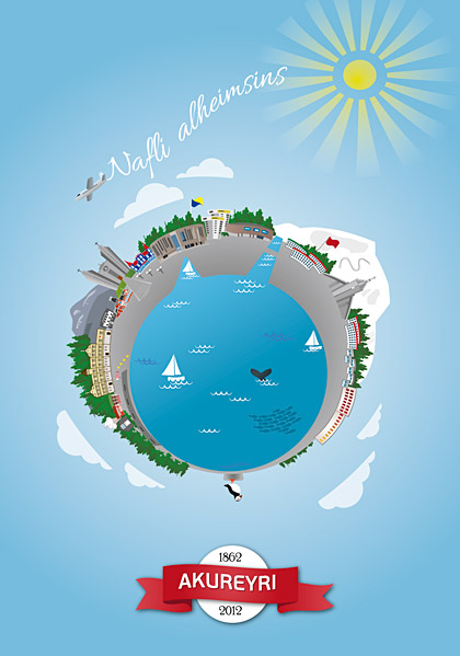
So from there the idea came, for celebrating the 150 years we made a poster which shows most major landmarks of the town as if its just one globe. We have the old town, the theatre, churches, culture house, shopping centre, ski area and the puffin on the rock represents the islands that belong to the municipality.
The poster that I illustrated for our town’s 150 year anniversary. The plane is writing ‘Navel of the Universe’ in the sky
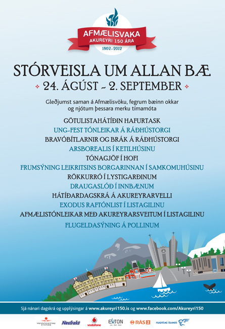
The advertisements were run in all print mediums as well as on TV, they had to include more text than could fit within the poster so we adjusted the illustration for the advertisements.
We received really great comments on the whole project, people saying it really captured the spirit of the town in an appealing and interesting way. That was the whole idea 🙂
Jan 11, 2014 | Design |
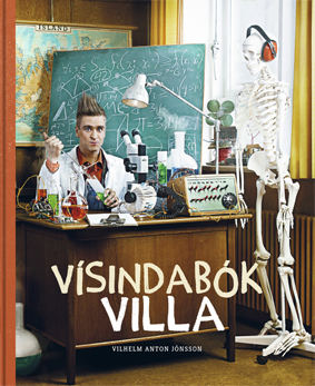
One of the most exciting projects we did at work last year was to illustrate a children’s book by a popular TV star, rock star and a friend of ours “Villi Jóns”. He decided to write a book for kids about science, all kinds of science and “scientific experiments”. Villi’s Science Book would be the translation of the title; “Vísindabók Villa”.
He contacted us, sent us the text he had written, which wasn’t very long for each spread so we had room for a lot of illustration. We thought of ways to illustrate it, making it appeal both to kids and their parents, so both of them would be interested in looking into things together and see how the world works.
Villi’s approach was to create curiosity in the kids minds, so they would start to ask questions and find ways to understand the world. He said that if the kids would get smart when they grow up then he’d have a better nursing home when he gets old, and maybe he’d get extra prunes or something.
Each spread would have a different topic, so the first spread was about dinosaurs, second about the solar system, the third about sound.. and so on… I illustrated the experiment spreads and a couple of the other and my colleague Gudrun at our design office Blek did the rest, as well as all the extra pages (index and such).
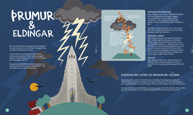
“Thunder and lightning” explained, using one of the most fameous landmarks in Reykjavik in a dramatic scene. Illustrated and layouted by me.
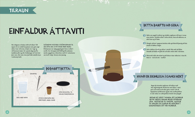
How to make a simple compass, using a needle, glass of water, cork and a magnet. Illustrated and layouted by yours truly
The project started in March and ended in June when the whole 96 page book, fully illustrated, layouted and prepared for print by us, was sent to print in Slovenia. The largest (almost dominating) book publishing company in Iceland decided to publish the book. Only 5000 copies were ordered in the first round, (seeing that the bestseller in children’s books is about 6000 copies). Note that there are only 30.000 kids of the age 6-12, which was our ‘target group’, who speak this language. The whole population of Iceland is 320.000 people. It’s a reeaally small country!
Exciting times came in October when the first copies arrived to the country and in the hands of the author. He was happy and sent us a bottle of champagne to celebrate! 🙂
It felt amazing getting hands on that book! The glossy hardcover, 25x30cm in dimension. Printed on the spectacular Munken uncoated paper. The fresh scent of ink, paper and glue. Mmm.. And the illustrations astonished us. They actually didn’t look that good on the monitor..
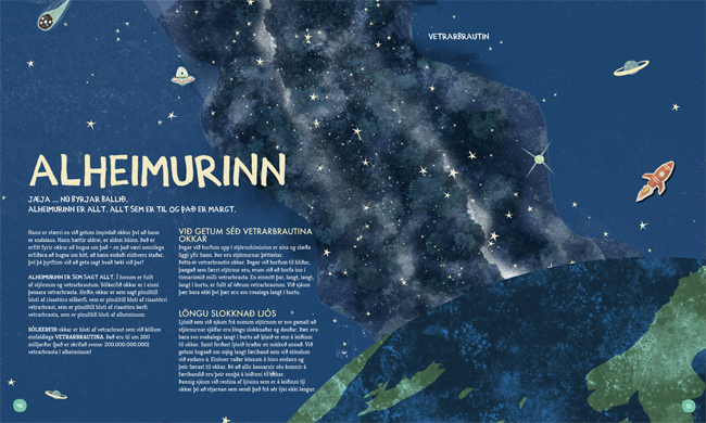
The Universe, earth and the Milkyway. Designed by Gudrun
We were really happy with the result. All of us. The goal was to make a book that we as designers would be happy with and proud of, regardless of what other people thought.
On October 10 it was published. 5.000 copies sent to the shops. We had made a website and a facebook page to support it but didn’t have any funding for more marketing. So that would have to suffice.
So ratings came in. The largest newspapers and all the main book critics loved it. 4,5-5 stars (out of 5) in all medias. In late October it became a bestseller, #1 in all sold books. Total – All categories. One critic even praised us for the illustrations, it’s not often that illustrators even get mentioned, let alone praised and thanked for.
In early November the book had almost sold out, the first 5.000 copies were almost gone and it had to be reprinted because the Christmas book season had only just started. Getting more copies from Slovenia would take months so it was decided to re-print it at Iceland’s largest printing company, the great printing office Oddi. That meant a whole new reprocess had to be made of the book with added startup cost. But obviously it was worth it because it sold out again in the same month, now 10.000 copies had been sold, the third edition started in late November, another 5000 copies made that had to last til Christmas. And it barely did. The printing office declined the request to print another 5000 saying that “they had other stuff to print this christmas, cards and such”. 😀
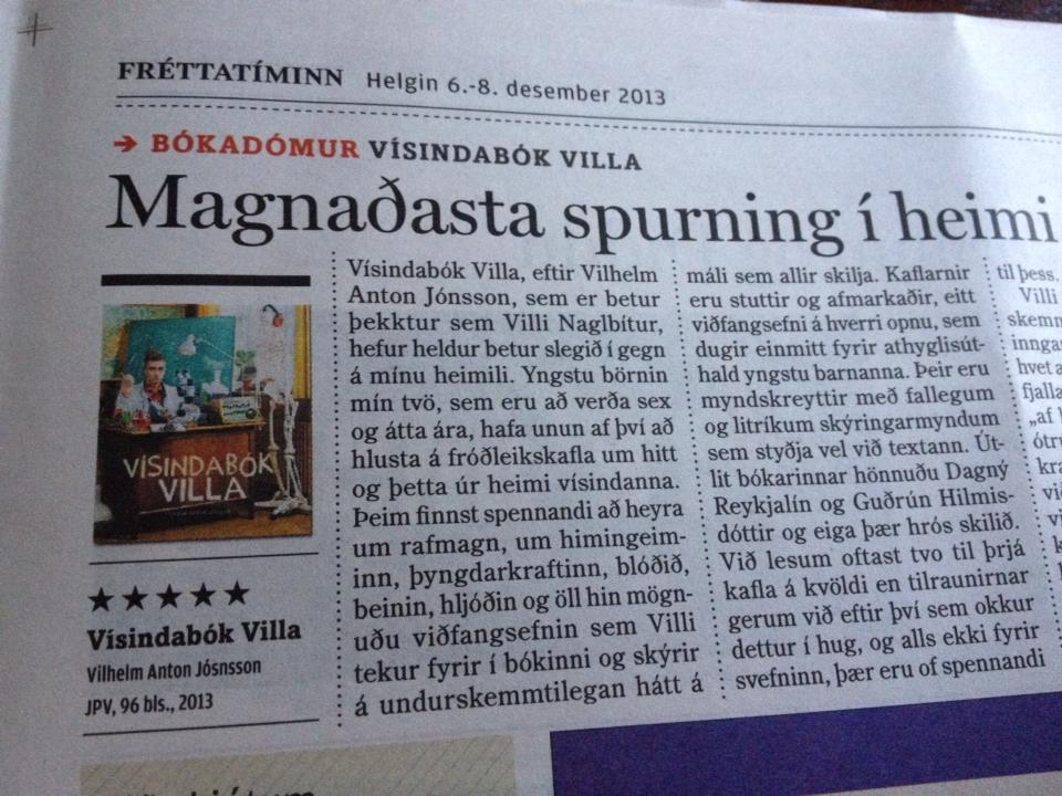
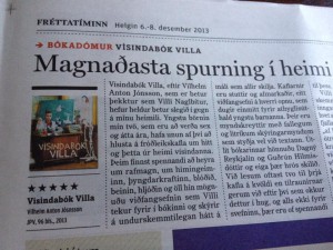
A newspaper interview with yours truly, the media was interested in how we approached the project.
So 15.000 copies almost sold out before Christmas, which made it the third bestseller of the year overall, bestseller in the Children’s books category by far and it was nominated for the Icelandic Literary Prize in the children’s book category, along with four other books. Results will be revealed in January.
We were gobsmacked. We had achieved something we never could have even hoped for. Even 15.000 copies sold meant that 50% of all kids aged 6-12 in Iceland owned this book that we made. 15.000 copies means that 4,7% of this countries population bought the book, in this small language area. I don’t know what these numbers would be if the ratio would be transformed onto any other country in the world. Must be some kind of a record. But Icelanders are pretty wild when it comes to books, like this BBC article explains.
So this little project pretty much tops everything else we did last year. Pretty much.
Added:
On January 26th we will participate in an annual exhibition in museum “Gerðuberg” which shows illustrations from recently published children’s books. The title of the exhibition is “This is what the children like to see”. The exhibition will travel around the country and be displayed in at least 7 different places this year.
Our pieces, in 50x50cm frames were:
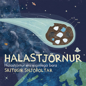
Comets are actually just dirty snowballs
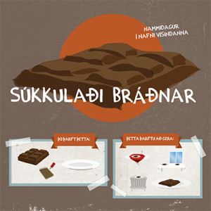
Melting chocolate